*FYI - this post may contain affiliate links, which means we earn a commission at no extra cost to you if you purchase from them. Also, as an Amazon Associate I earn from qualifying purchases. Check out our Privacy Policy and Disclosure. for more info.
In the wild world of Instagram, one of the most coveted of all honours is being dubbed “Instagram feed goals”.
You’ve seen them – envy of the town… Beautiful people holding beautiful foods in beautiful locations, somehow always with consistent lighting and colours. In this eerie parallel universe where aesthetics reign supreme, many of us who rely on Instagram for our blogs/brands start to wonder how to get an Instagram theme of our own, and more importantly, how to establish a killer ‘look’ that will have followers coming back for more. Let’s face it, having a cohesive Instagram isn’t easy, and there are too few resources that actually walk you through how to achieve it!
*puts on cape*
That’s why I’m here today. One of the most common questions I get about my Instagram is how I get my feed to have a certain ‘look’ to it. After years of desperate researching, existential crises and plenty of trial/error, I’ve learned that a cohesive Instagram feed is much more than just ‘using the same filter’. Today’s tutorial will break down how to get it done.
So, wondering how to make your Instagram feed look good? This post will walk you through how to get a cohesive theme going, alongside the tools you need for making it happen.
The basics of having a cohesive Instagram feed
It’s pretty ironic that a platform with “Insta” in its name now boasts various apps/tools that help you schedule, plan and scheme your way to success. That said, I guess “plan ahead and try not to cry”stagram doesn’t quite have the same ring to it. We’ll be chatting in-depth today about all the steps and tools you need to make an Instagram theme, but first – let’s run through some basics.
Nailing your account ‘concept’
Remember, at the end of the day, people are following your account for a reason. In order to get a cohesive Instagram feed, you need to firstly take a step back and decide what that reason is. In other words, what value are you bringing to the table? You should strive to provide this value with every single post you publish. For example, I consider my ‘concept’ to be dreamy travel photos with a relatable twist. I’m still working at it, but having this theme in mind helps me decide what to post and how to caption it.
ACTION ITEM: Take some time to reflect on your account ‘concept’, and be specific. What is your account’s “thing”? Are you a stylish fashionista showcasing the best of New York City? Are you a colourful globetrotter on the hunt for the world’s tastiest foods? Do you showcase ways to live a ‘cozy’ and minimalistic life? Remember to nail down your personal brand first to ensure that your feed is conceptually consistent.
Understanding the importance of your ‘top 9’
When someone clicks on your profile, they have a few seconds to decide whether or not you’re worth a follow, or if they should jump out the window and run the opposite way. This is precisely why it’s so important to have a stellar selection of photos at the top of your feed that are not only gorgeous on their own, but work well together. One glance is all it takes for a prospective follower to decide whether or not you’re worth their time, so be sure that your top 9 photos gel together in an inviting (and enticing) way. Your top 9 grid will be changing with every upload, so it’s important to consider not only how images look next to each other in a row, but also above, below, diagonally, etc.
Embracing the many different ways to get a cohesive Instagram feed
As we discussed before, the most important thing is having conceptual cohesion. This is important not just visually, but for your followers to have a good idea of what to expect from you. This helps build up a loyal audience, and goes far beyond just what your photos look like. It also has to do with your voice, captions and general mood. So, remember that when we are talking about developing a consistent Instagram theme, it’s more than just how your photos look, but what your account is like as a whole. For example, I often post funny travel stories/musings in my captions to accompany my ‘dreamily edited’ photos. How do you think followers would feel if I all of a sudden started quoting gangsta rap lyrics instead?
So, remember to think of your theme as a broader concept than simply what your photos look like! Now onto the good stuff, the step by step…
How to make an Instagram theme for yourself
Download an app that allows you to plan your feed.
Unless you’re an all-knowing psychic (in which case, please send me some lottery numbers), odds are you won’t know what your images will look like as a feed until you post them. Luckily, there are plenty of apps out there that let you plan out/schedule your posts. This is SUCH a gamechanger in terms of creating a more consistent feed for your Instagram. It not only takes the guesswork out of how well your photos will work together, it also allows you to create a schedule in advance!
I love UNUM for this. It’s not only free, but also lets you easily add multiple photos, drag and drop them to get a nice ‘feed’ going, plus you can hide certain images and shuffle the feed view to look at your many options. Other popular ones include Later and Planoly.
Create a badass arsenal of editing tools.
If you’re doing all your photo editing in Instagram, you are stuck in 2010, my friend. Times have changed, and nowadays there are enough editing apps out there to drown even the floatiest of hipsters. Truly, there is SO much potential for editing outside of the Instagram app itself and you’d be doing yourself a huge disservice if you didn’t dabble around in the options. Here are some recommendations for you (both paid and free).
My go-to is Lightroom, although it’s an expensive choice. It gives you unreal flexibility in editing and you can also download/save ‘presets’ which allow you to get a similar visual vibe with a single click. They do have a free app for mobile, although it’s much more limited than what you get with the real program.
VSCO is the perfect app for getting that filmy, hipstery look that is so popular on Instagram these days. Best of all, it’s free and quite customizable.
Snapseed is my favourite for phone editing – I make use of its “brush tool” all the time to bring out certain colours, and I always run my photos through the ‘Curves’ function to get a little faded look. [It’s also free!]
A Color Story is another brilliant app for phone editing which gives you way more control over your photo than Instagram does. I especially like that you can adjust the color of highlights/shadows which is really handy in giving photos a certain color ‘tint’. There are paid add-ons as well that are really cool.


Decide on the value/mood you want your feed to have.
Instagram is about visuals yes, but above all else, it should be about feelings! *lights some mood candles*
As in, how do you want people to feel while looking at your feed? Inspired? Cozy? Hungry?
In order to develop your Instagram theme, considering your feed’s “mood” is really important. This goes for both your visuals and your captions.
ACTION ITEM: Try to write down your account’s mood and the value it brings to the table. Focus on individual words. Ex. For me, I think “dreamy, funny, relatable”. Keep this somewhere handy because you should ensure anything you post will embody these words in some way!
Start brainstorming your visual vibe and how you will create it.
Okay, now that you know how you want your account to make people feel, you need to work at creating the visuals that will evoke those emotions… consistently. Yikes. I know. It’s hard. Instagram is hard, and I, too, am attempting not to cry right now.
BUT, let’s make one thing clear: creating a consistent visual vibe is about way more than just using the same filter. This is because filters just apply the same effects to each photo, and because every photo you take will differ in terms of lighting conditions, camera settings, etc., it’s highly unlikely one filter will yield the same visual result every single time.
That’s why when developing a cohesive Instagram theme, it’s more helpful to think of things in terms of visual properties rather than just filters. That sounds confusing, but it’s super simple (I promise).
Here are a few things to consider while editing and putting together your visual theme:
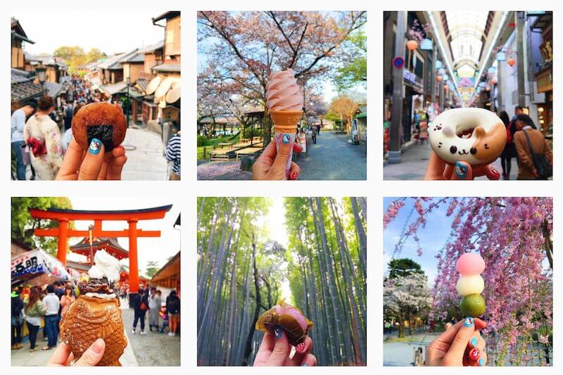
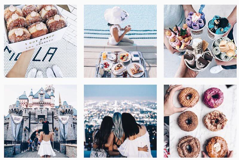
Color palette: many users are embracing Instagram color themes as a way to get cohesiveness. This means posting mostly photos that feature a certain color, or combination of colors. This can look amazing when done properly, but is rather limiting in terms of what you post. If you want to go this route, Coolors is a lot of fun for generating customized color palettes.
Brightness/exposure: Are you going for a bright airy feel (this is what I go for!) or something darker and grittier? The brightness and exposure of your photos plays a HUGE role in the visual consistency of your Instagram feed, so try your best to keep that part of your editing process consistent.
Saturation: Will your feed have a very bright, saturated look, or will you go for something a little more toned down? It’s important to decide early on because otherwise your feed will really clash.
Warmth: The temperature of your photos have a very immediate impact on the mood of your feed. If you go for warmer colours, that evokes a very different feel than say, harsh greys and blues. Try to match up the temperature feel of your photos with your desired theme ‘mood’.
Contrast: AKA “the scale of difference between black and white in your images”. Having high contrast photos will mean more striking, vibrant, bold photos. On the other hand, low contrast photos will look more muted, dreamy and romantic.
Blacks and whites: This one is crucial, and one of the biggest epiphanies I had in my quest for Instagram cohesion! In simple terms, if consistency is what you’re looking for, your colours should be the same throughout your gallery, as in, your whites should be the same ‘white’, your blacks should be the same ‘black’, etc. To get the dreamy, ‘faded’ look I use, you’ll notice that I make use of the Curves tool on Snapseed to ensure none of my blacks are ever fully jet black, rather a dark grey instead. Having this consistency really helps tie your gallery together.
Overall “tone”: You’ll notice that some Instagram feeds seem to have a coloured tint on them that binds the photos together. This is another, easy way to achieve a cohesive look. To get this, play around with the colours of your shadows/highlights. The ‘Color’ tool on Instagram lets you do this easily within the app.
Last but not least… Practice makes perfect.
Once you’ve nailed down your theme, you’ll start to develop a sixth sense for what will work and what won’t. Remember, like in most cases, practice makes perfect, and it’ll only get easier.
Bonus ‘Instagram Feed Goals’ Tips
AKA how to make your Instagram feed look good af
Sometimes, your feed won’t look quite right for some random reason you can’t put your finger on. Trust me, I know… those mega first world concerns have kept me up at night too. Based on personal troubleshooting, here are a few solutions to general ‘feed ickiness’:
Mix up the angle and perspectives
A great way to get some nice, interesting variation in your feed is by playing around with different angles and perspectives. Too many far-away landscape shots might be boring after a while, likewise if all you do is post #OOTD posts from the exact same angle. Getting some variation in shots (then strategically arranging them using a scheduling app) can do wonders in making your feed a touch more droolworthy.
Go for a consistent pattern of post types
Another method of creating a consistent feed is by establishing patterns, like for example alternating between inspirational quotes and regular photos. Done properly, this can look really cool.
Leave some white/blank space every so often
One of the biggest culprits to blame for a ‘blah-looking’ feed (for me at least), is clutter. You can have the most gorgeous photos in the world, but when they all stack next to each other in a busy mess, you’re not doing them any justice! Using negative space really helps break up your feed and reduce the amount of overwhelm. For instance, if you post a busy detailed shot of a gorgeous building, why not pair it with a colourful, minimalist wall or flat lay right after? The key is to use a planning app like UNUM to drag/drop until items look good next to each other.
The ‘matching colors’ trick
One thing that helps me match photos together for my feed is looking at the colour elements in each one, and ensuring that there are common colours between photos that touch. For instance, if I have a pretty pink sunset in one shot, then a lush green jungle in the next, these items will most likely not work well together. In contrast, if I went from a pretty pink sunset to a flat lay featuring pink and green pops of colour THEN went into the jungle shot, the shots would probably work better together. Keep this in mind during your maniacal drag + drop planning!
For extra inspiration, try this: create a mood/brand board for yourself on Pinterest
Sometimes, inspiration and motivation runs low. That’s when it’s handy to have some visual inspo on the ready. I use a Secret Pinterest board for this, where I save photos and content that resonate with my personal brand/Instagram. This can be handy for getting the creative juices flowing when you’re suffering from Instagrammer’s Block. (Is that a thing? … it is now. Mwahaha)
At the end of the day, remember – with Instagram (and life, tbh) it’s a constant struggle and process to get things right. If you were to scroll down far enough on my Instagram page, you would able to pinpoint the many times I panicked and switched up my look out of pure indecisiveness. Your feed will adapt with your style over time, and that’s totally okay. Just breathe. *hands you a lollipop*
And hey, if you liked this post, why not pin it for later? Click the Pin It button for a full sized version.